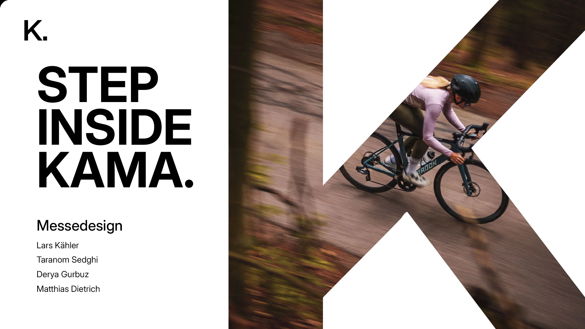
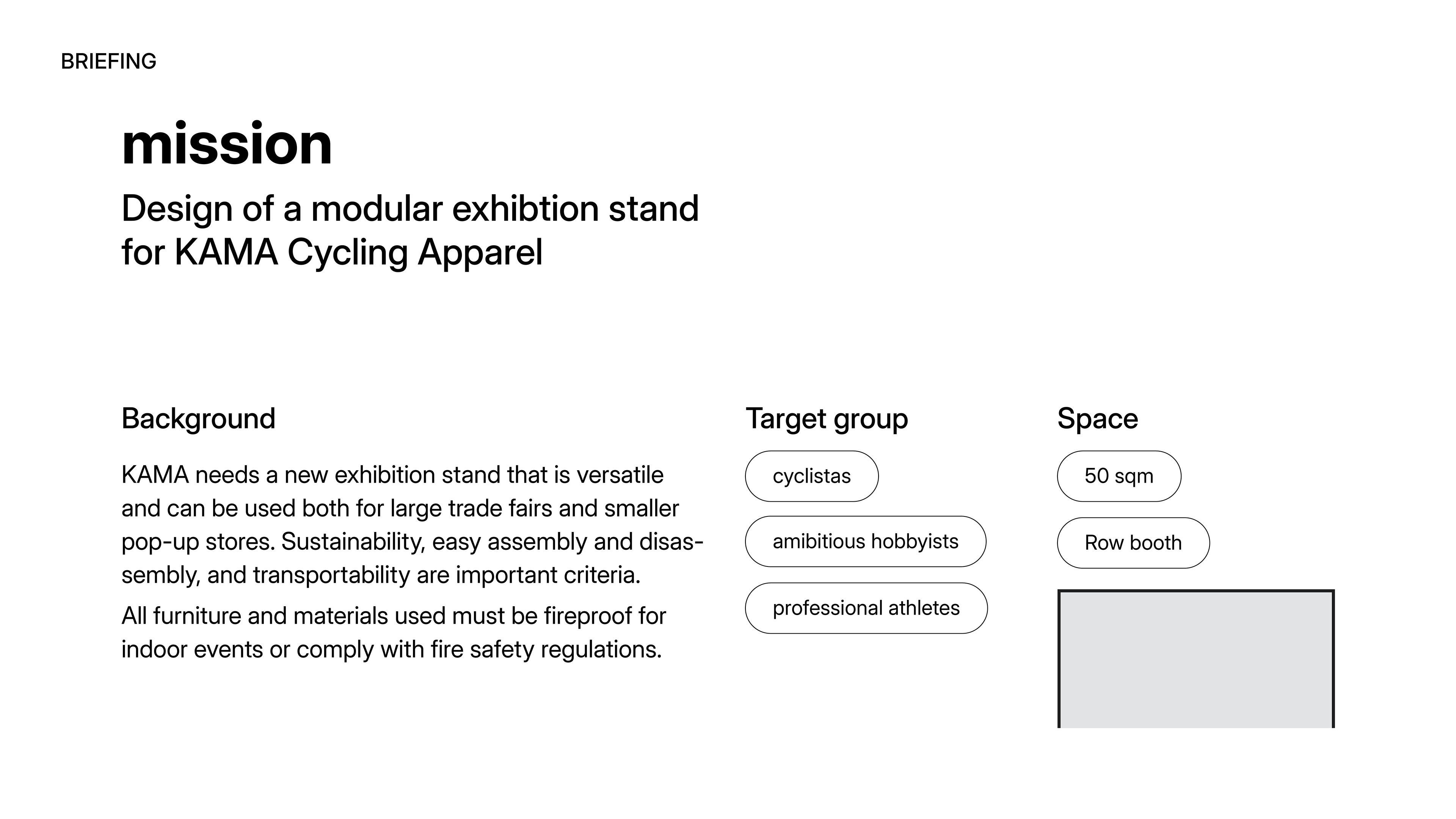
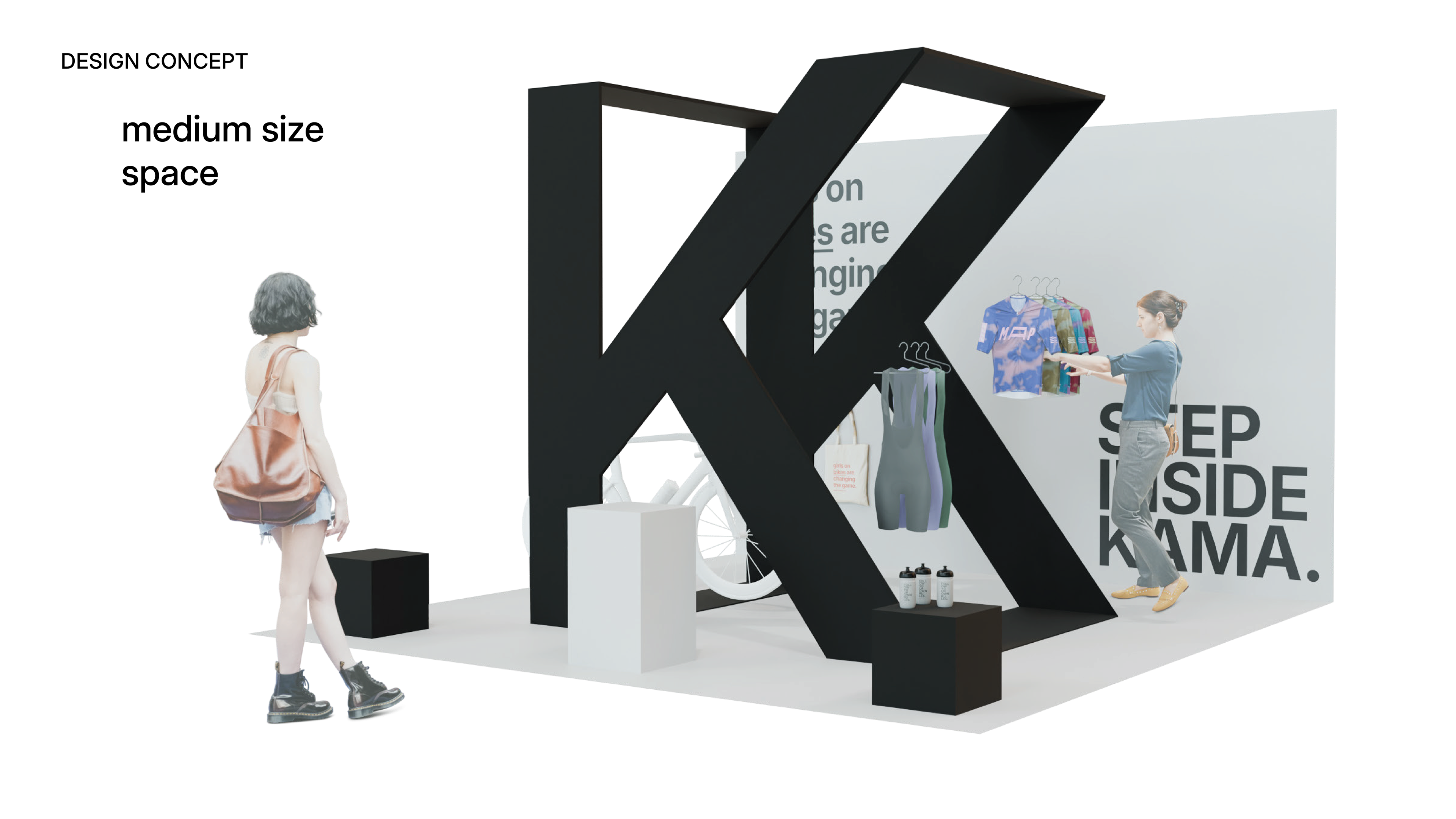
This project was developed as part of a trade fair design workshop during my master’s in Exhibition Design, where we were tasked with creating a booth for a real client, KAMA, a clothing brand for women cyclists. Here, you will find a summary of the exact pitch we presented for a 50m² booth, along with two additional design variations for smaller fairs, pop-ups, and compact spaces. These alternatives showcase the flexibility of our concept, demonstrating how it can adapt to different settings while maintaining a strong and cohesive brand presence.
We started by analyzing KAMA’s brand characteristics and expectations to ensure alignment. Based on their briefing, we developed a brand prism defining their identity. minimalist aesthetics, high-quality materials, and a strong, independent personality.

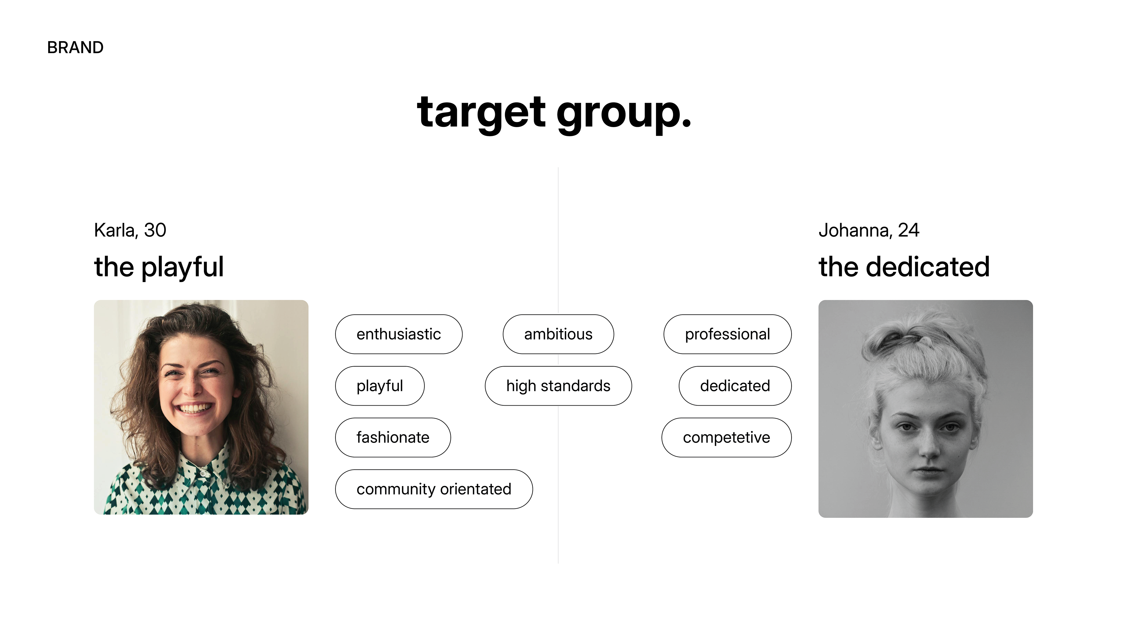
To understand their audience, we created two key customer personas: Karla, 30, a playful, community-oriented cyclist who values fashion and enthusiasm, and Johanna, 24, a dedicated, competitive rider with a professional mindset. These insights shaped our approach to engaging both casual and performance-driven cyclists.
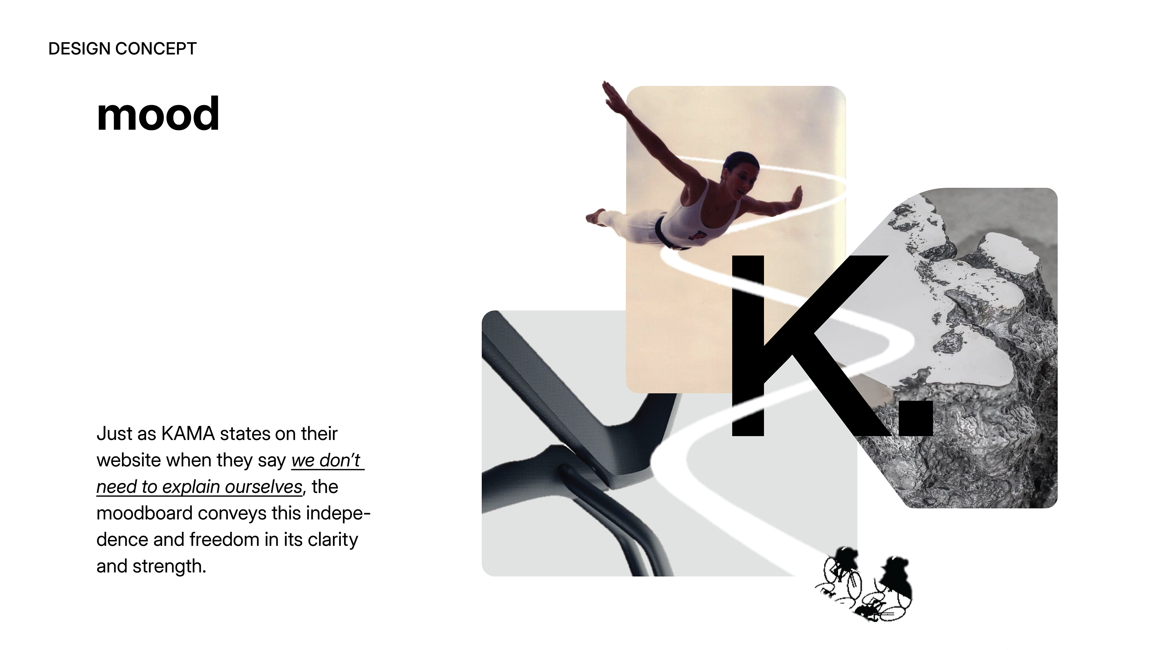
Next, we introduced our design approach, starting with a mood board to establish the foundation. We aimed for a mood that felt strong, independent, and free, reflecting the brand’s identity while staying connected to nature, an inseparable part of biking.
We then mapped out the visitor’s journey, creating curiosity and guiding the audience to understand what to look for in the later stages of the presentation.
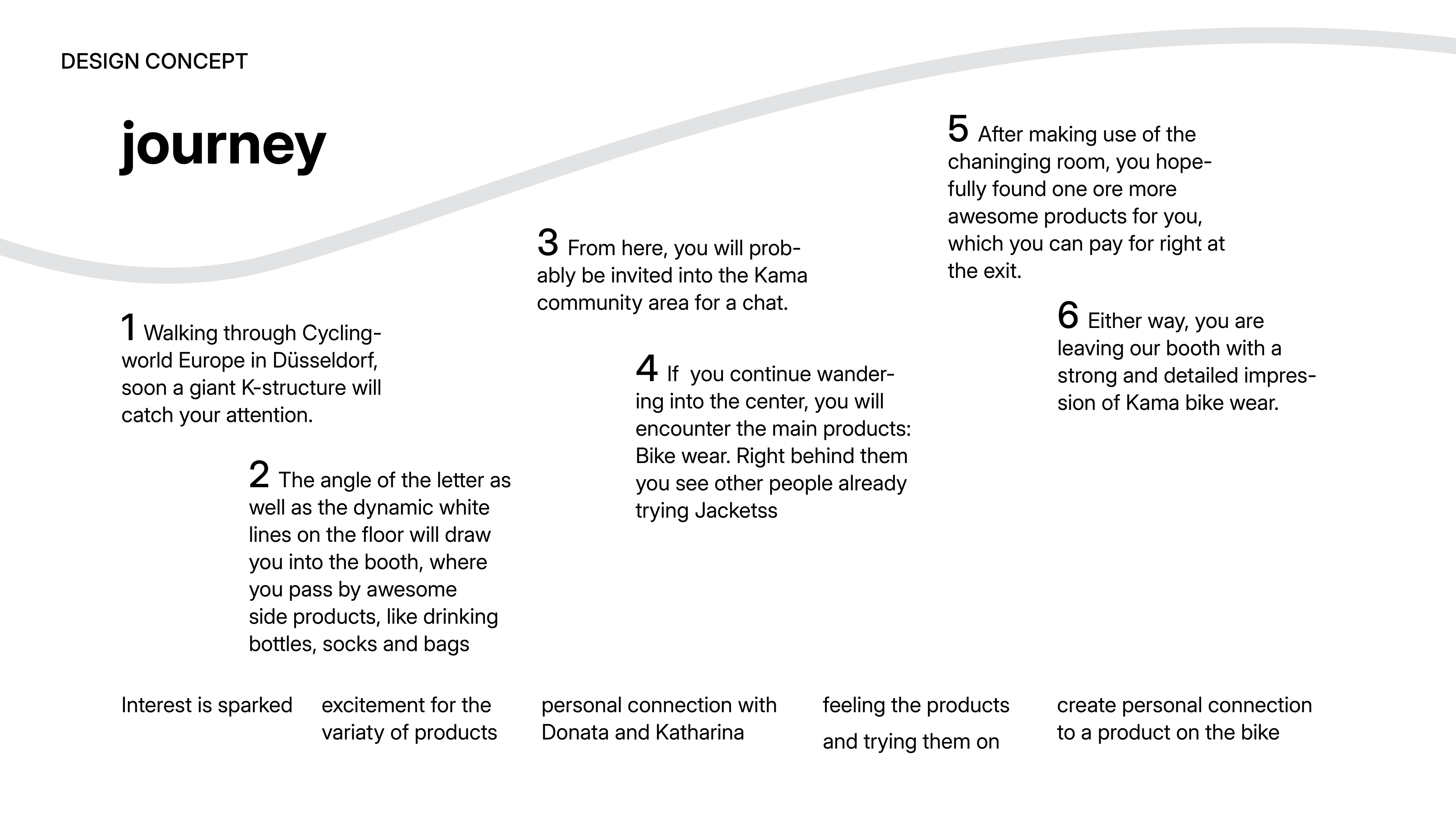
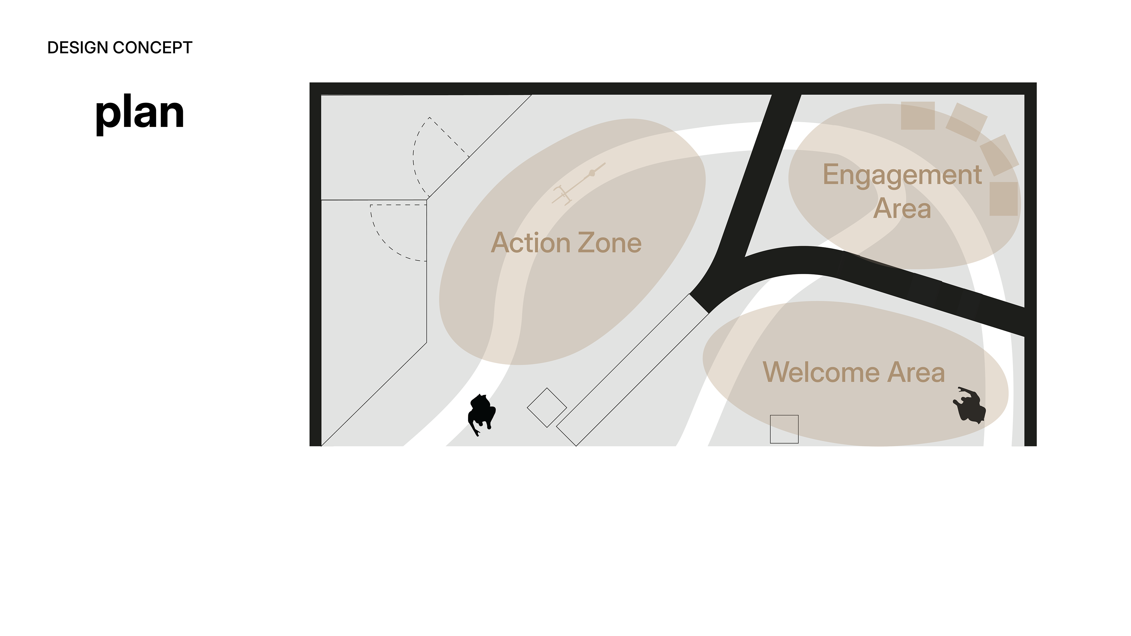
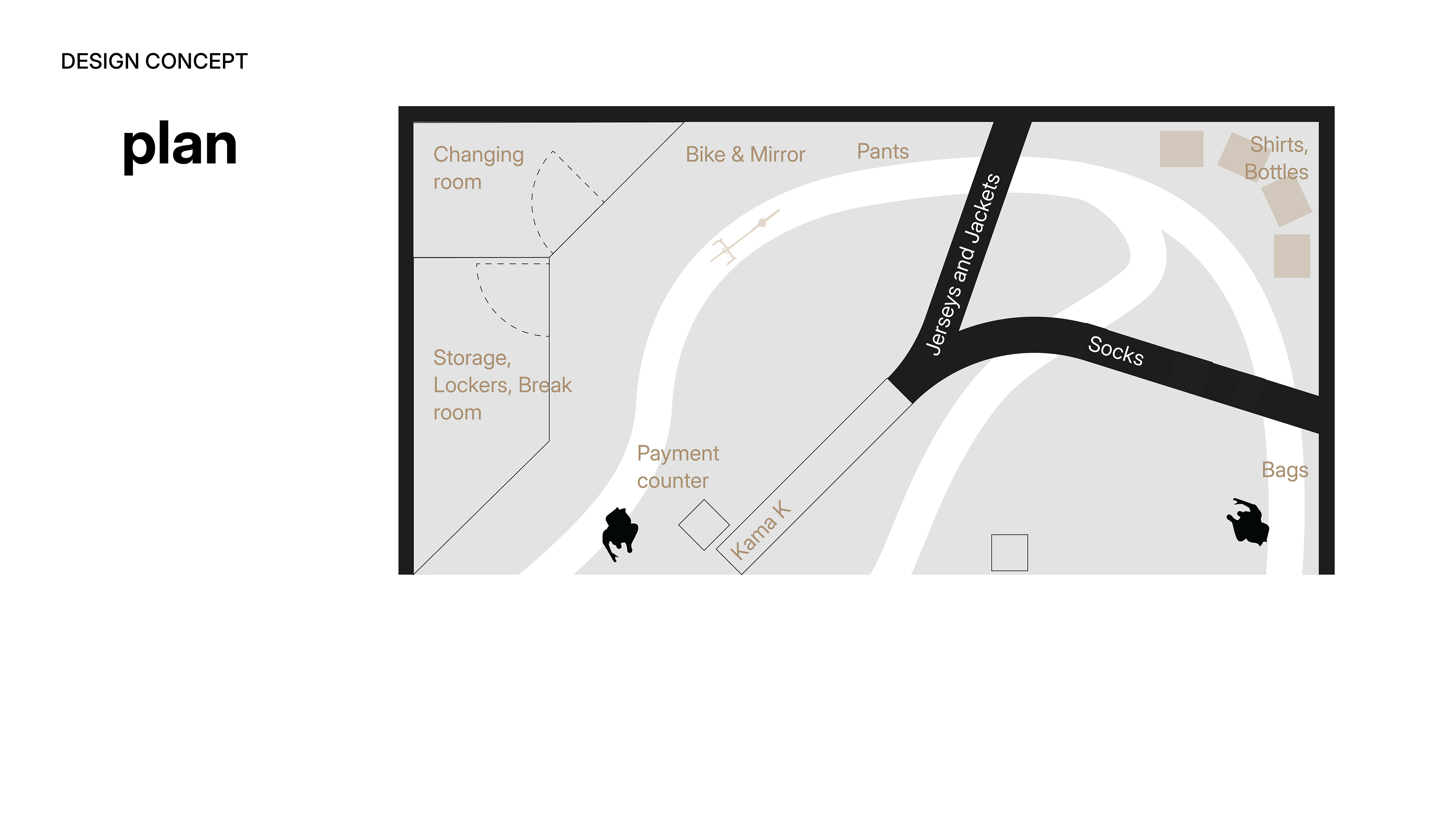
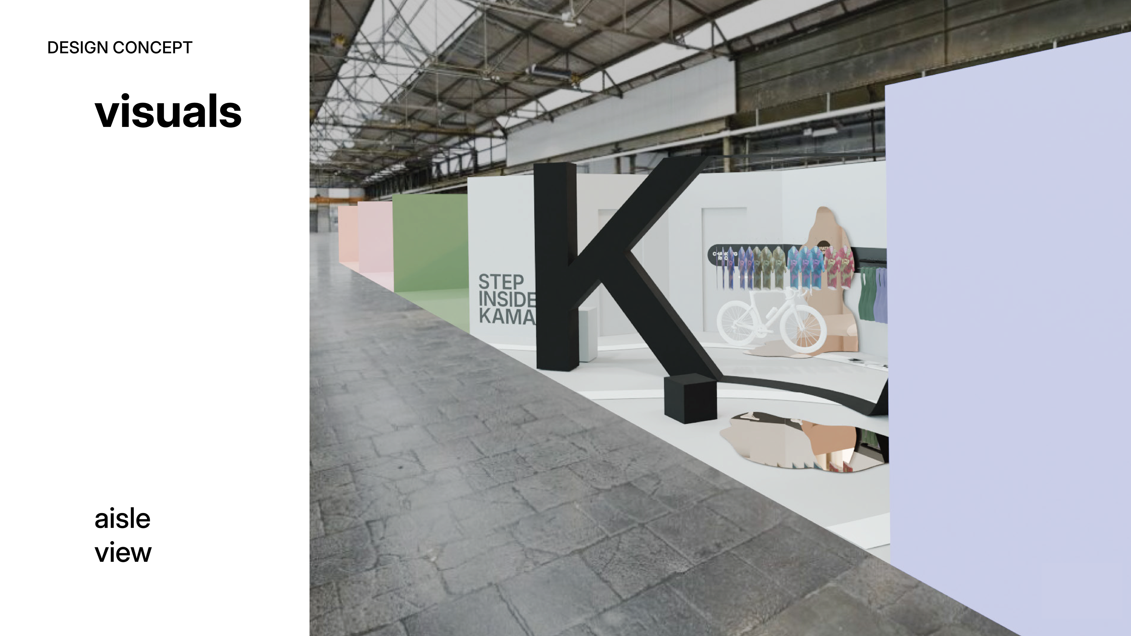
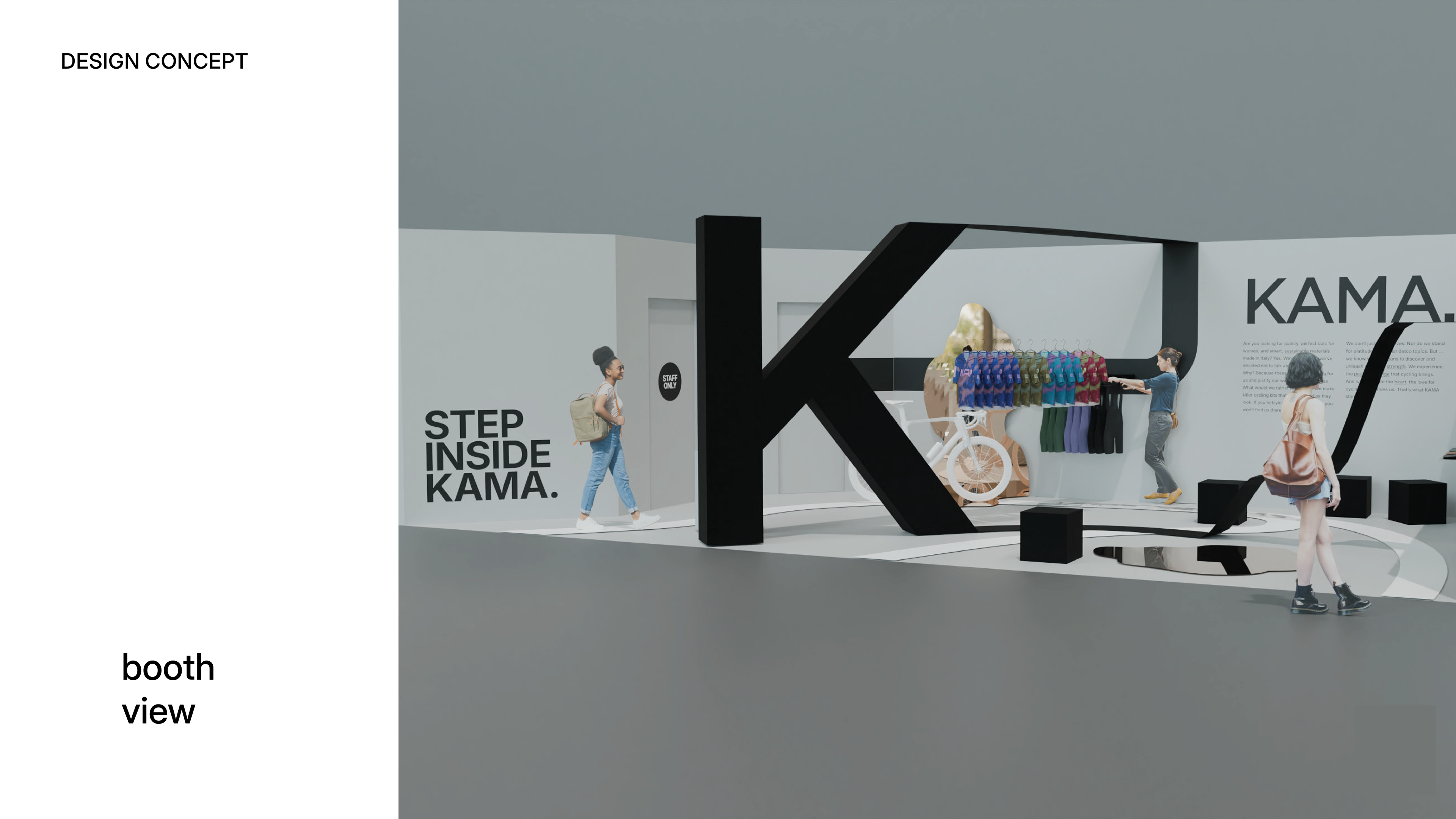
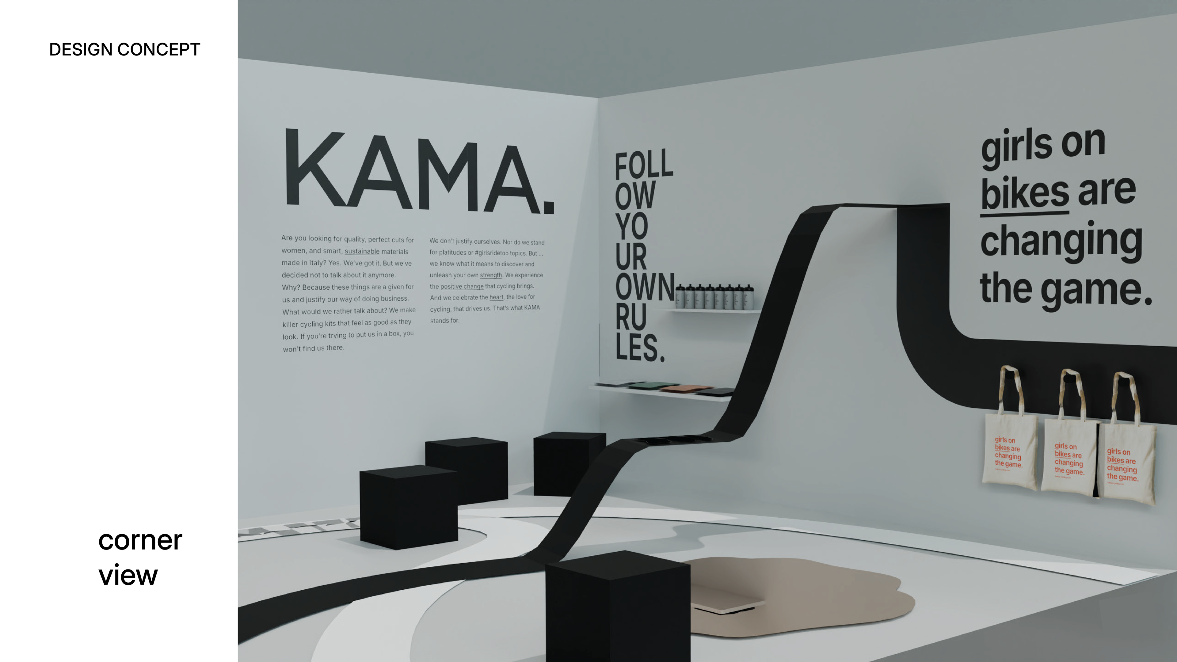
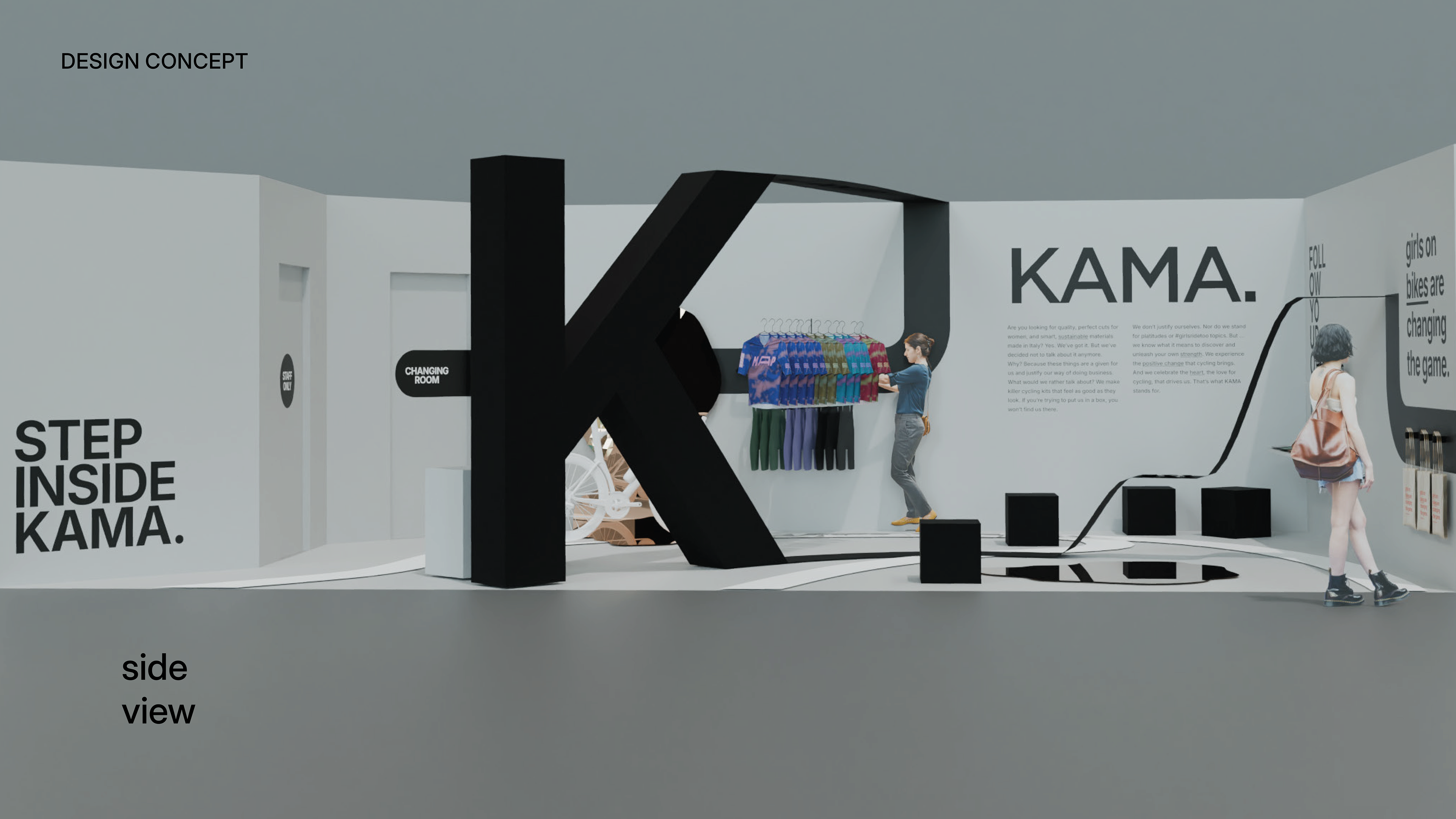
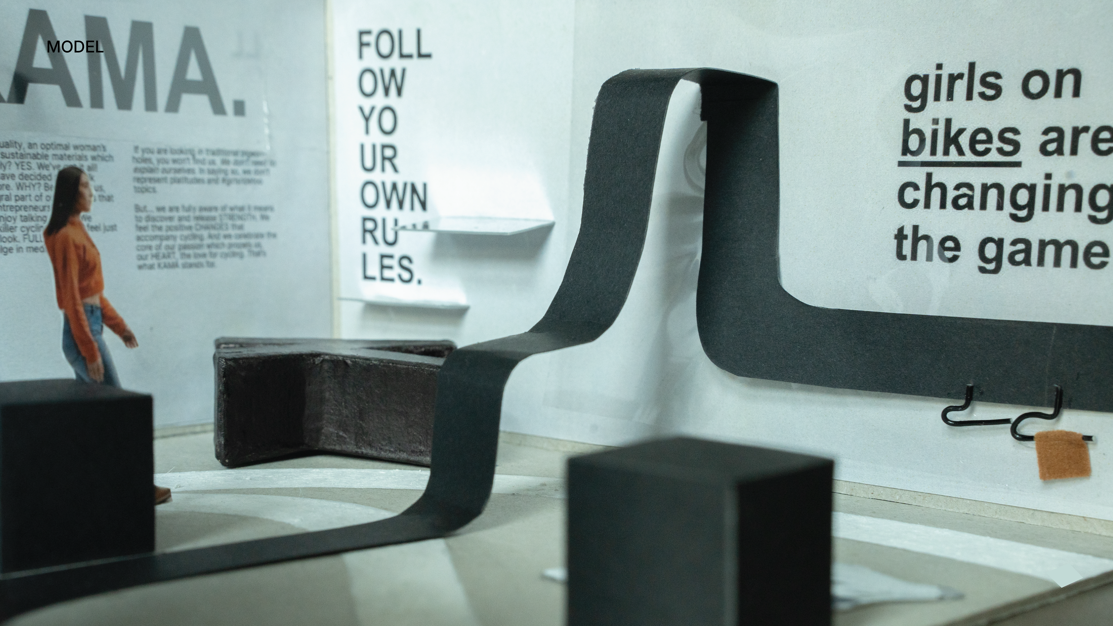
Throughout the presentation, we discussed the different stations and products and how they would be showcased within the booth. We also explored the angles and perspectives from which visitors would experience the space, ensuring an engaging and dynamic presentation.
Alongside the renders, we presented the scale model, allowing them to see the design from different perspectives and gain a better understanding of the space.
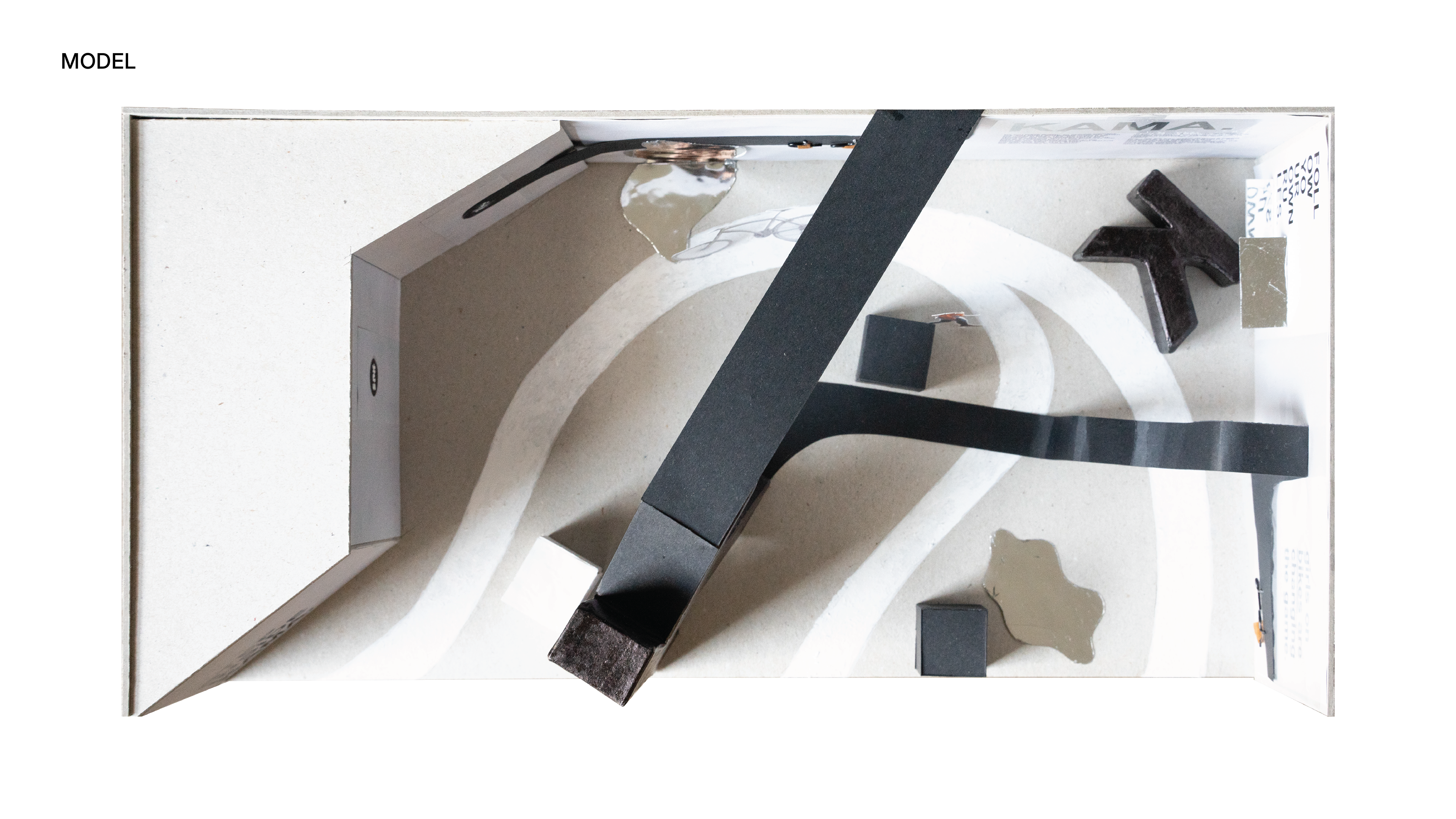
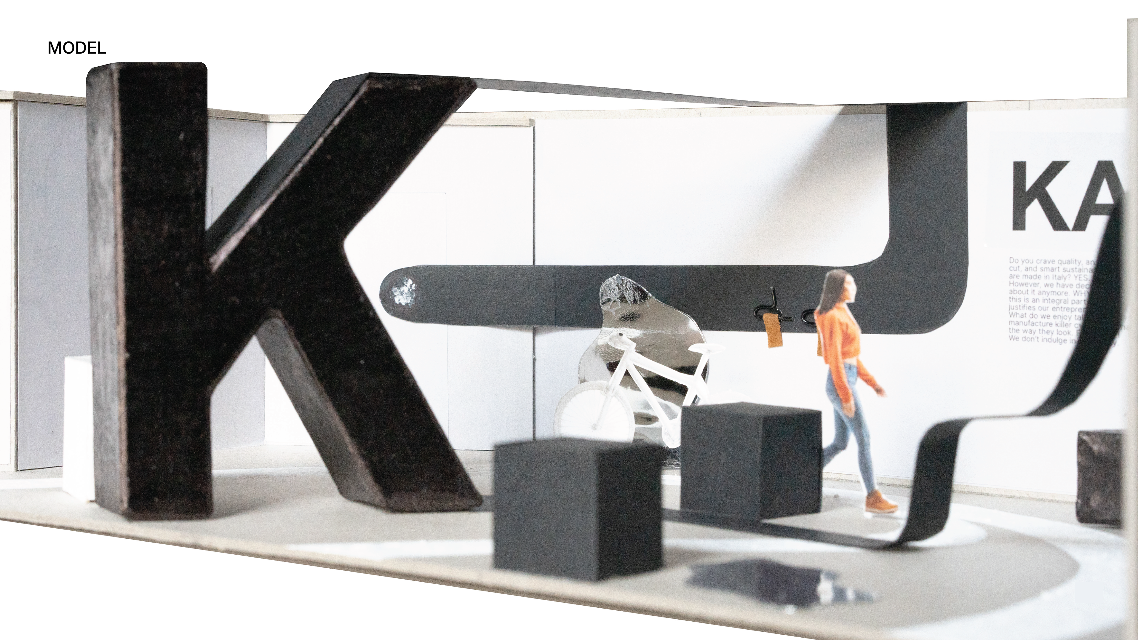
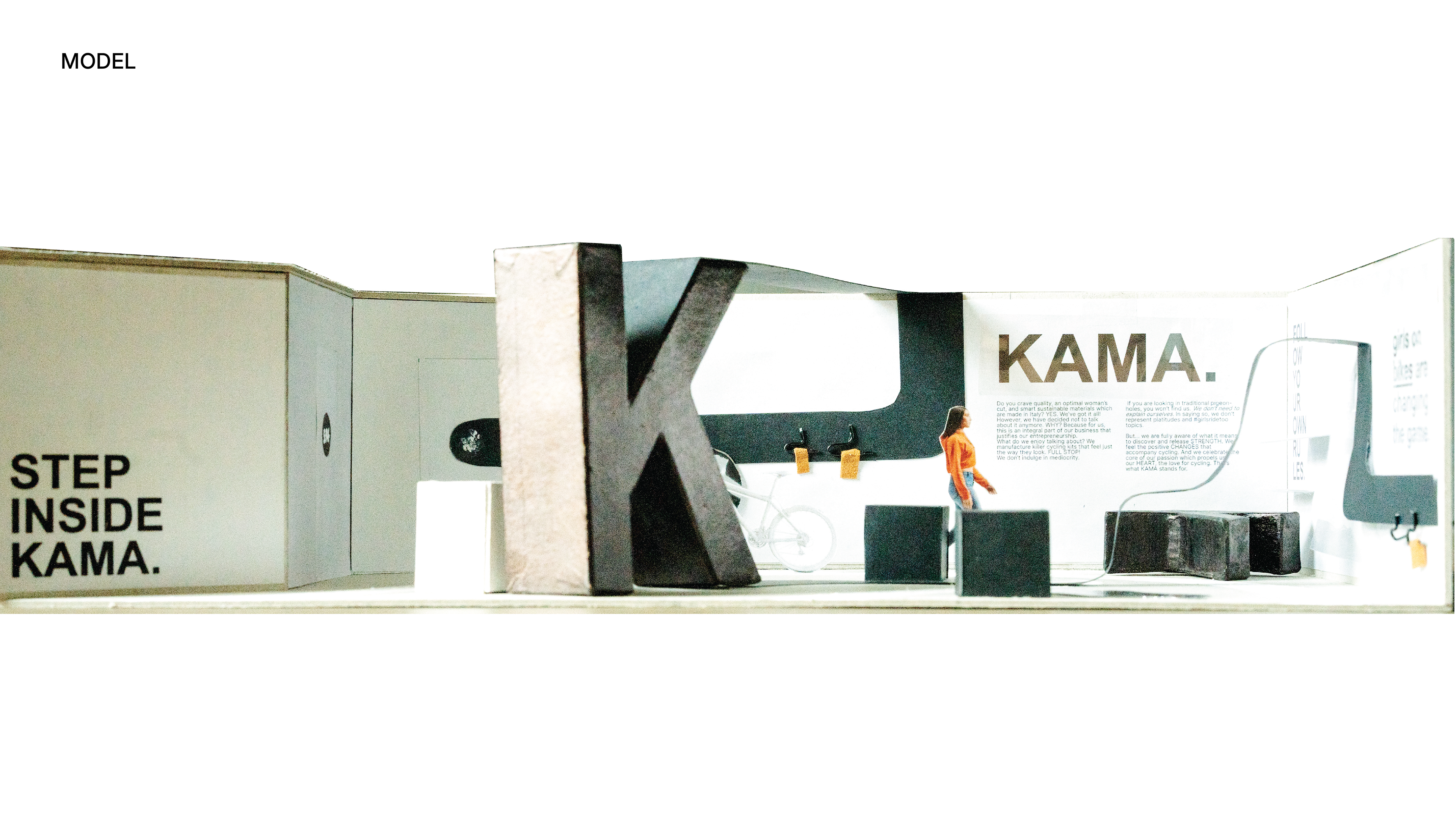
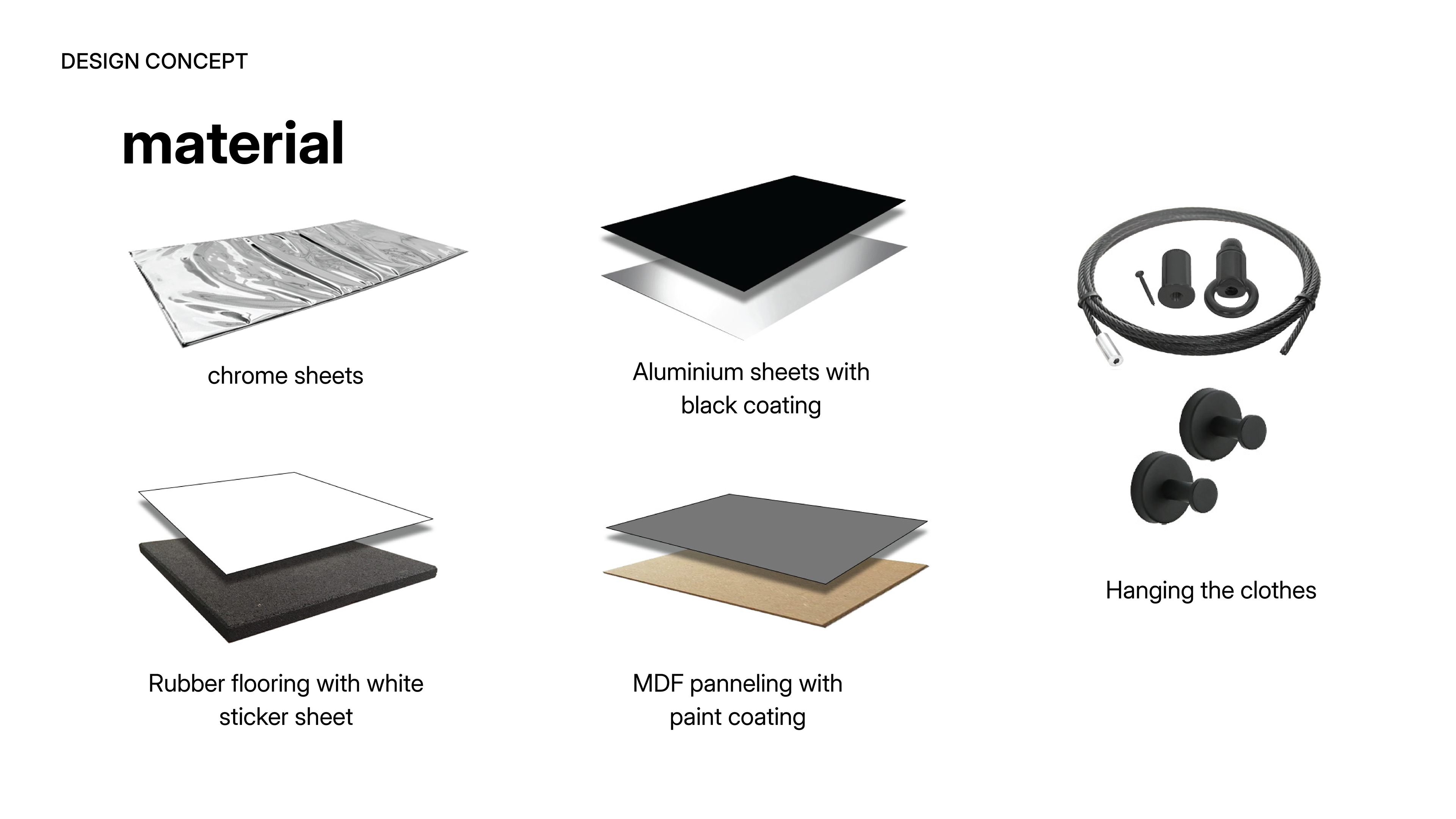
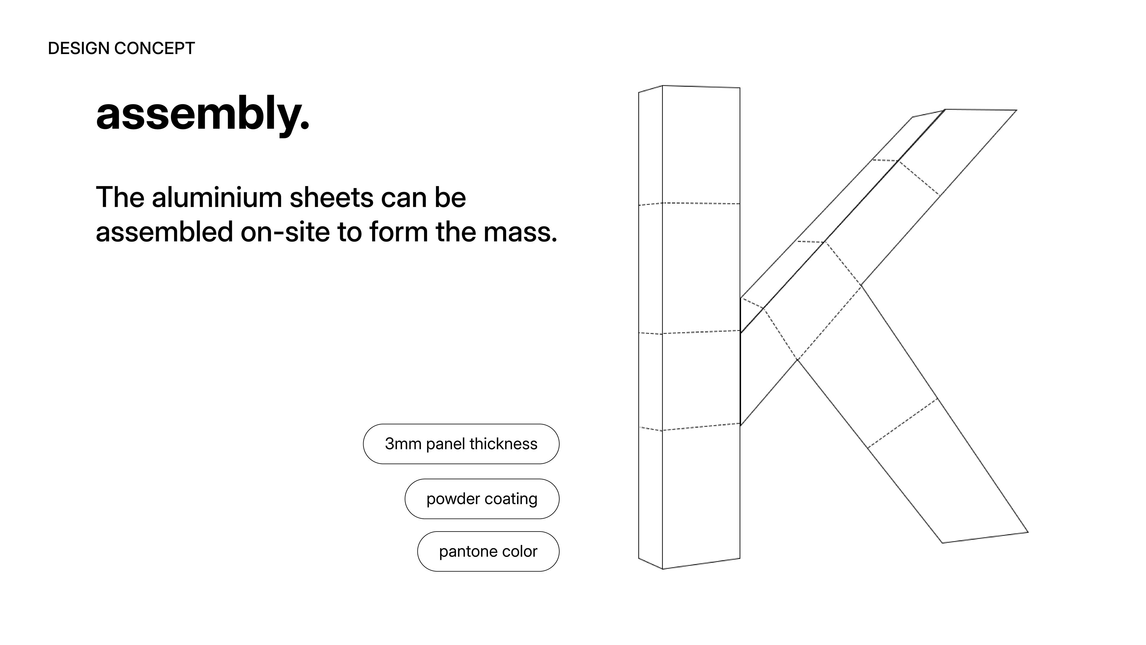
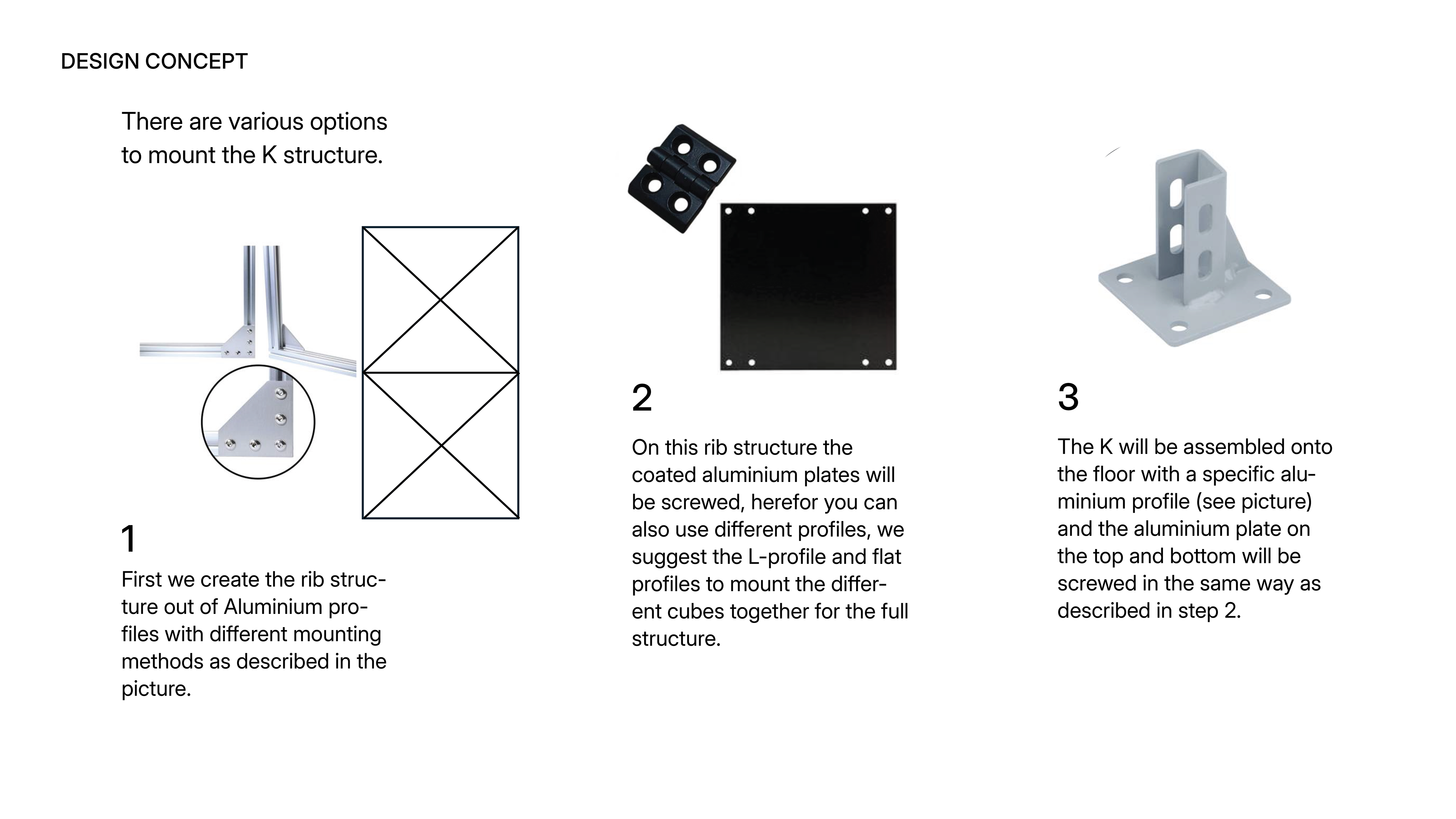
Then, we dove into the details, discussing materials and assembly. Since they are a two-person team, we focused on how the big K could be assembled and disassembled by just two people, making it adaptable for different locations.
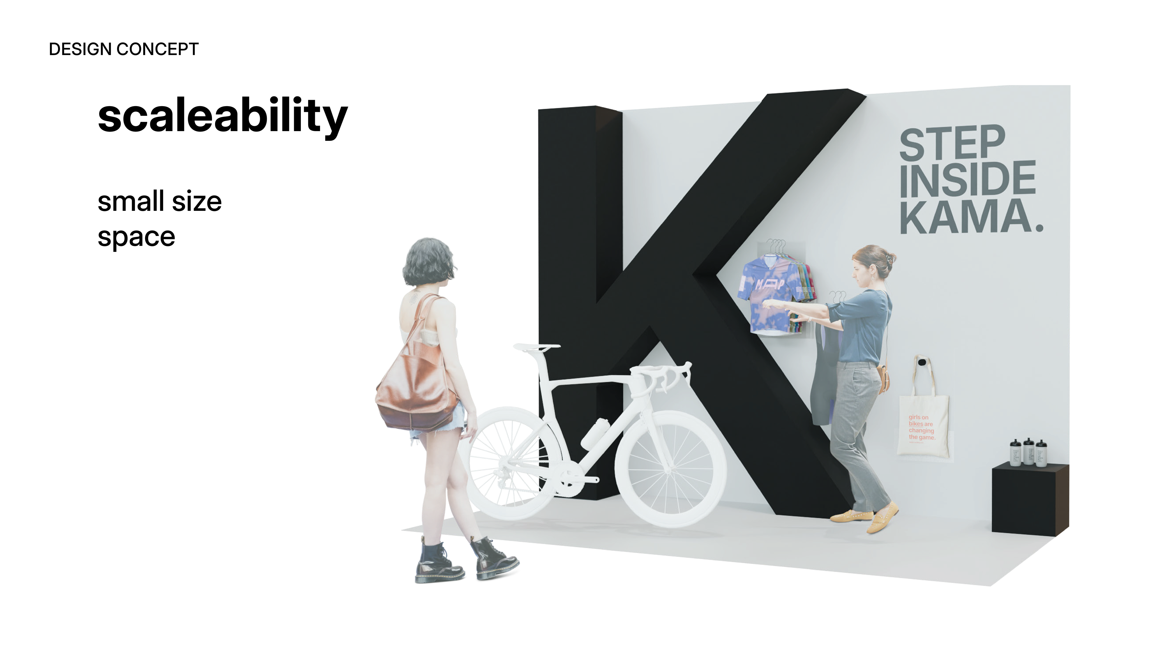
At the end, we emphasized the scalability of our booth. We presented two options, both centered around the K as the main eye-catcher, with the rest of the design built around it to adapt to different spaces and needs.
This project was meaningful to me because I never saw myself working in booth design. At first, it felt too strict and commercial, but the process changed my view. We began by studying the brand in depth—its values, personality, and position in the market—treating it almost like a person. We then translated these insights into a booth concept that reflected the brand and met practical needs. The experience showed me that booth design can be both creative and strategic, and it made me see it as a possible direction for my future work.