Communication design2025Visual identity · Packaging
Dot Pastry rebrand
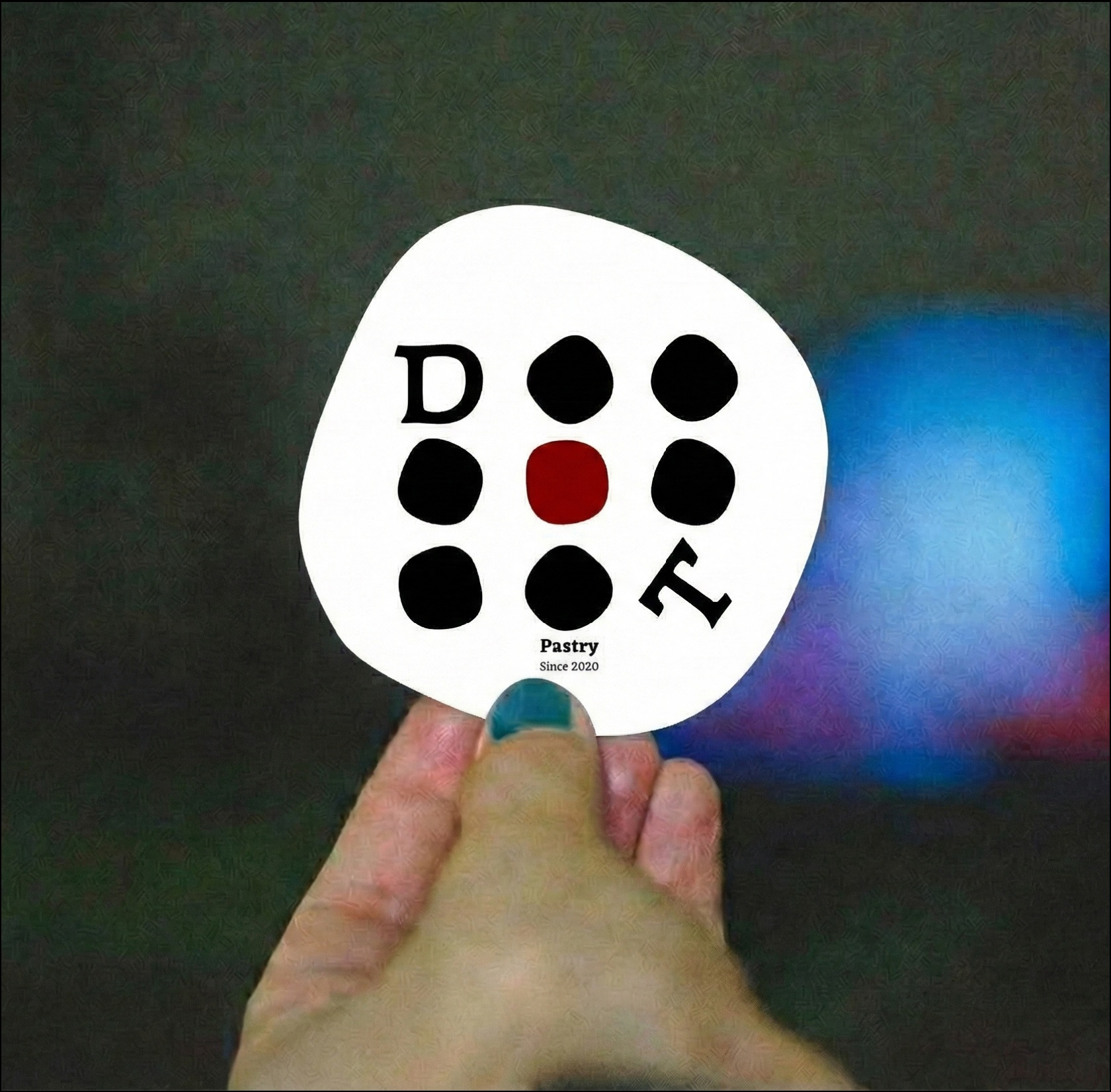
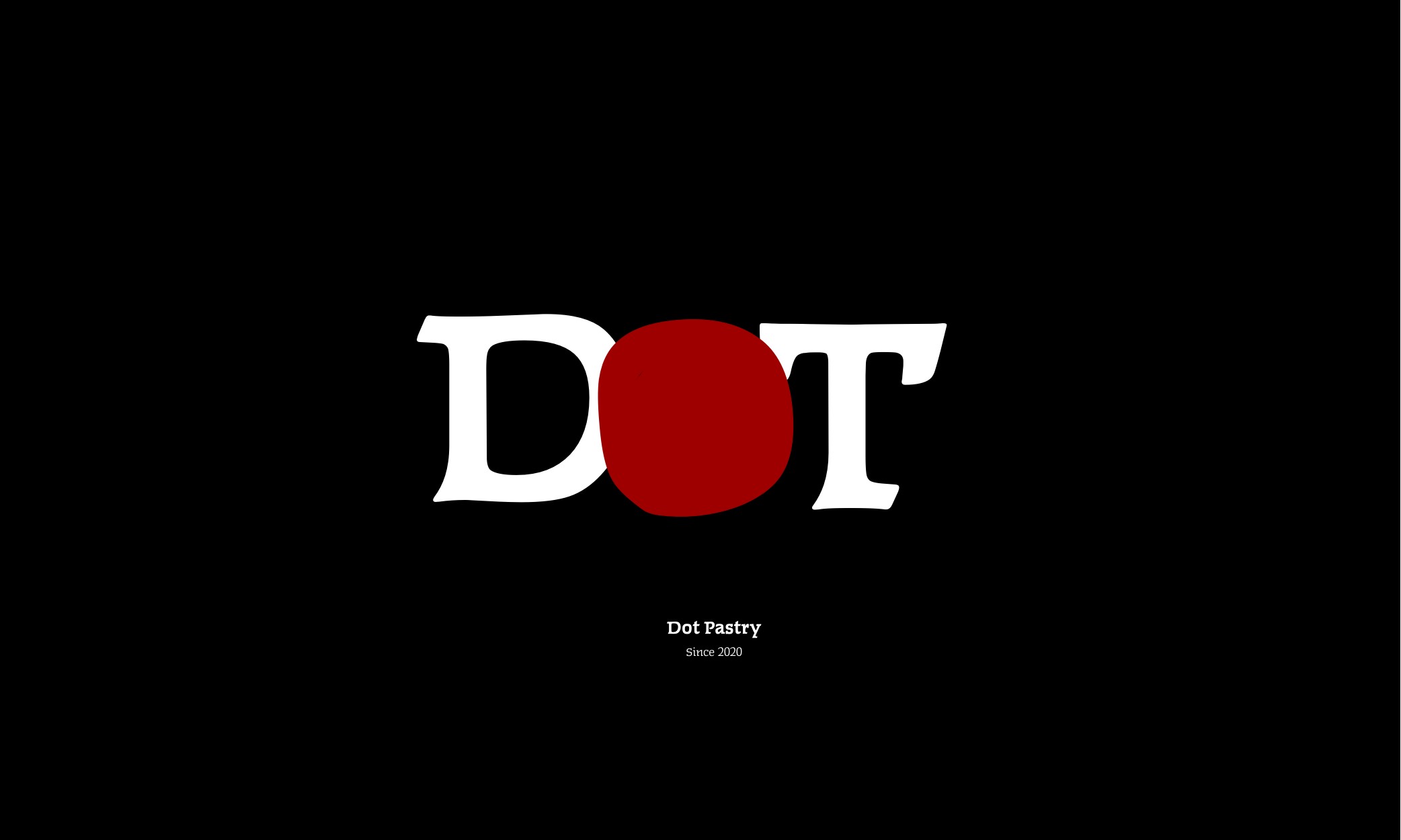
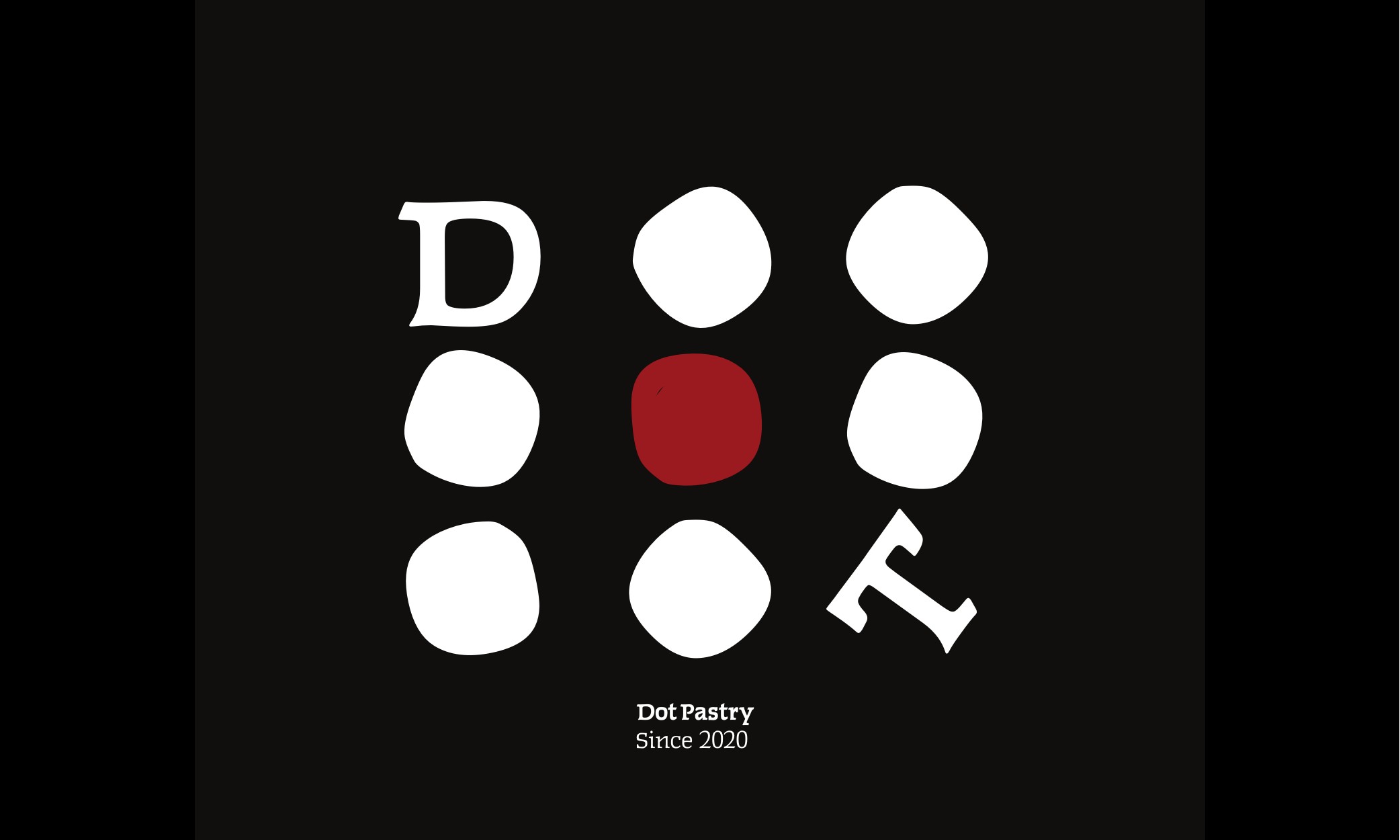
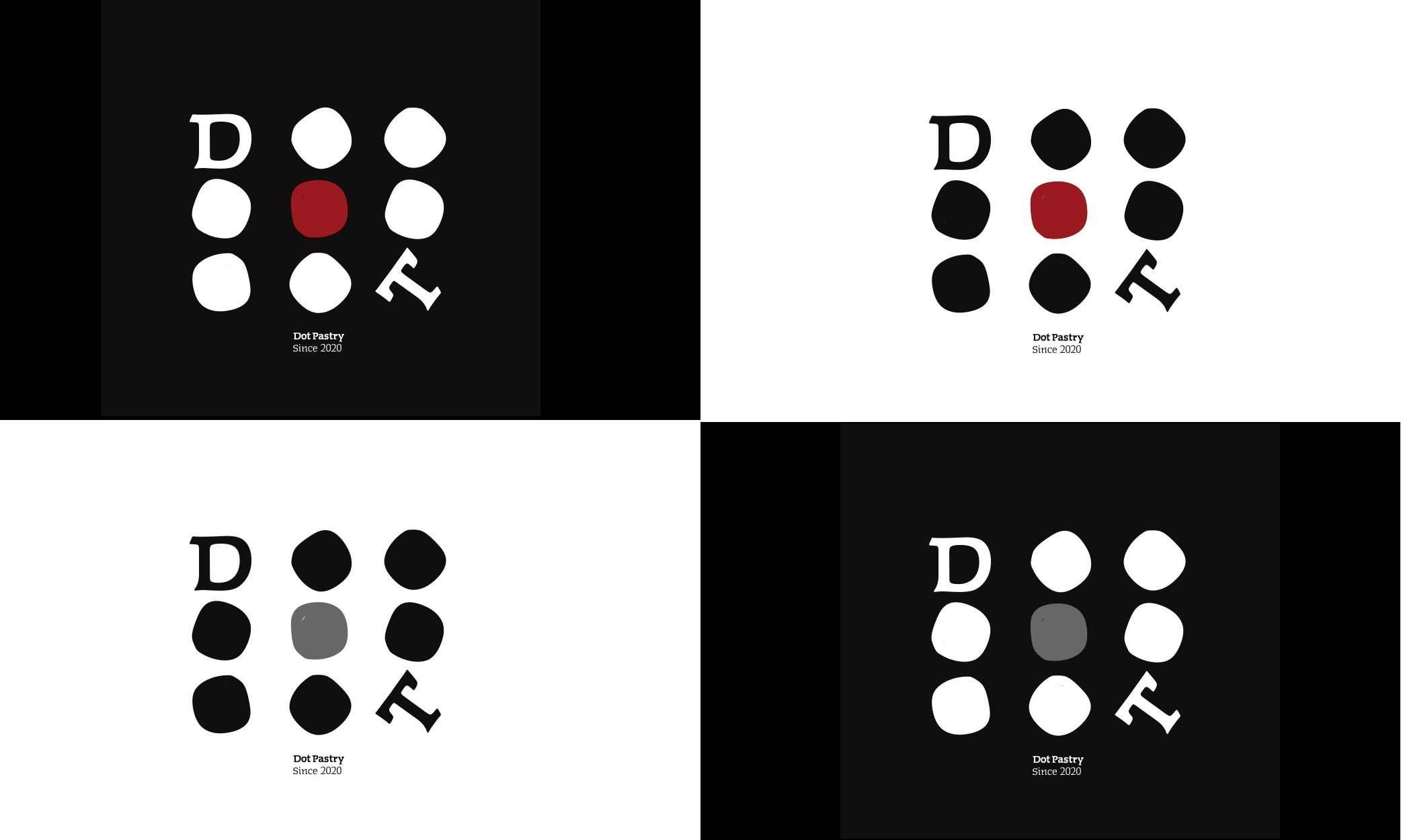
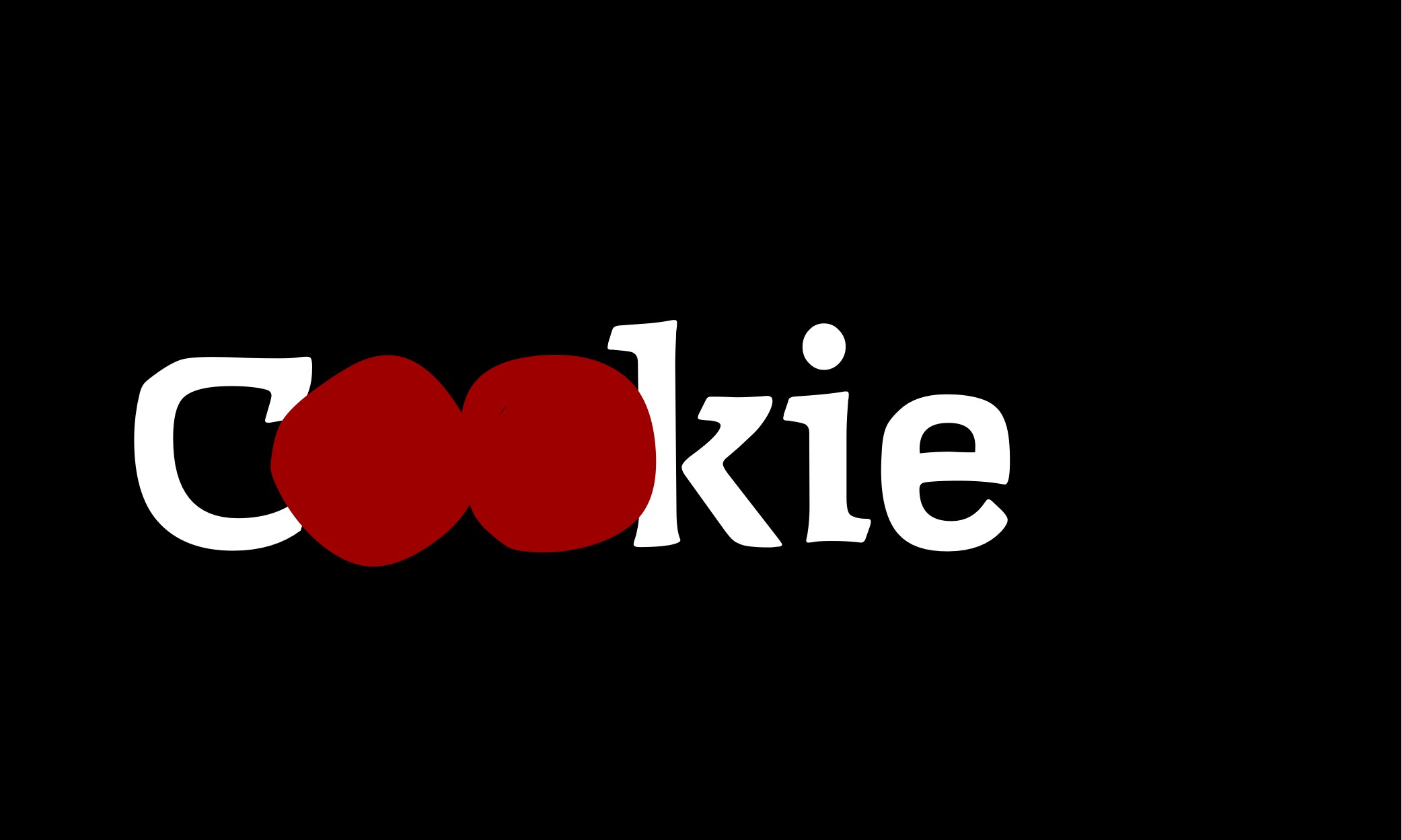
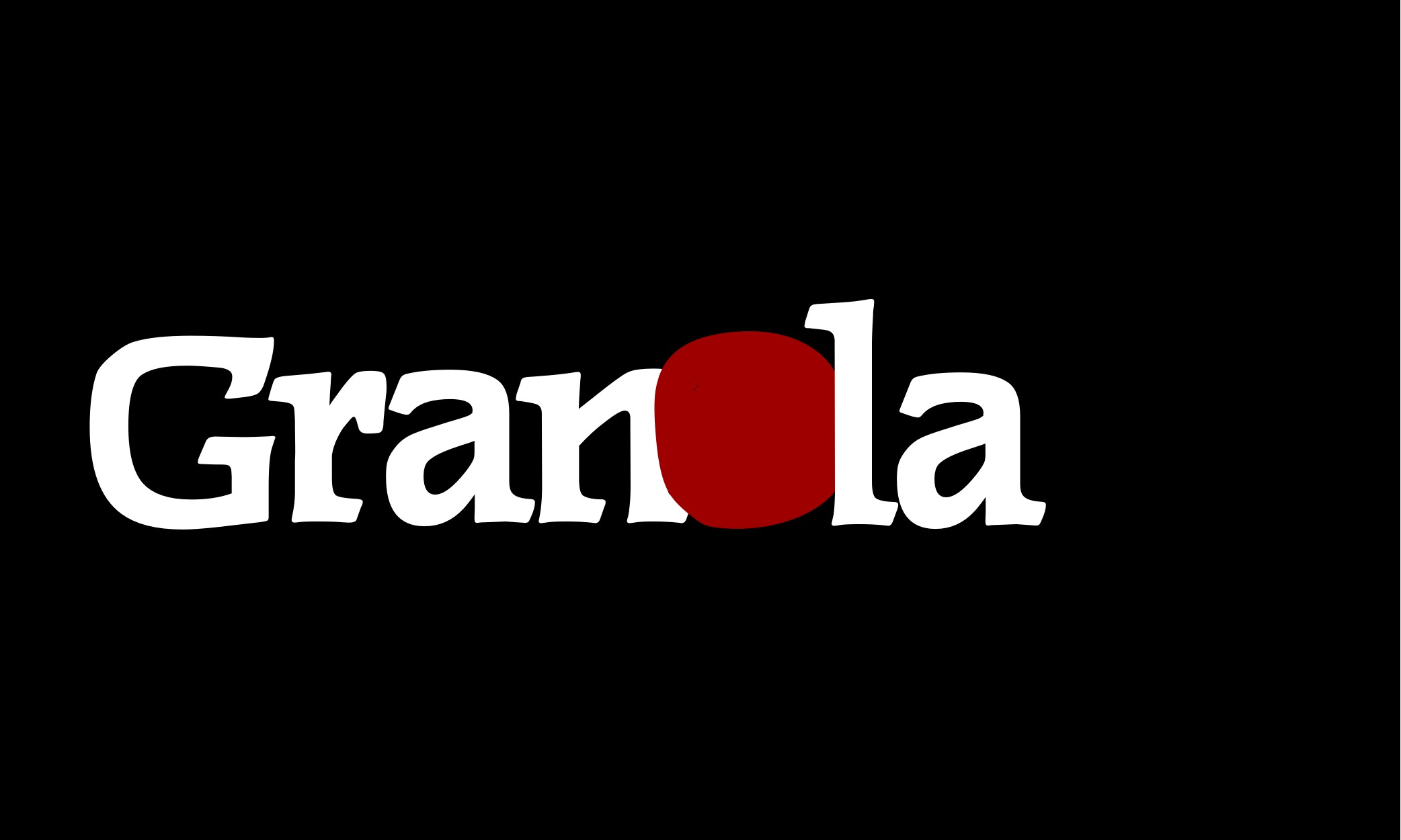
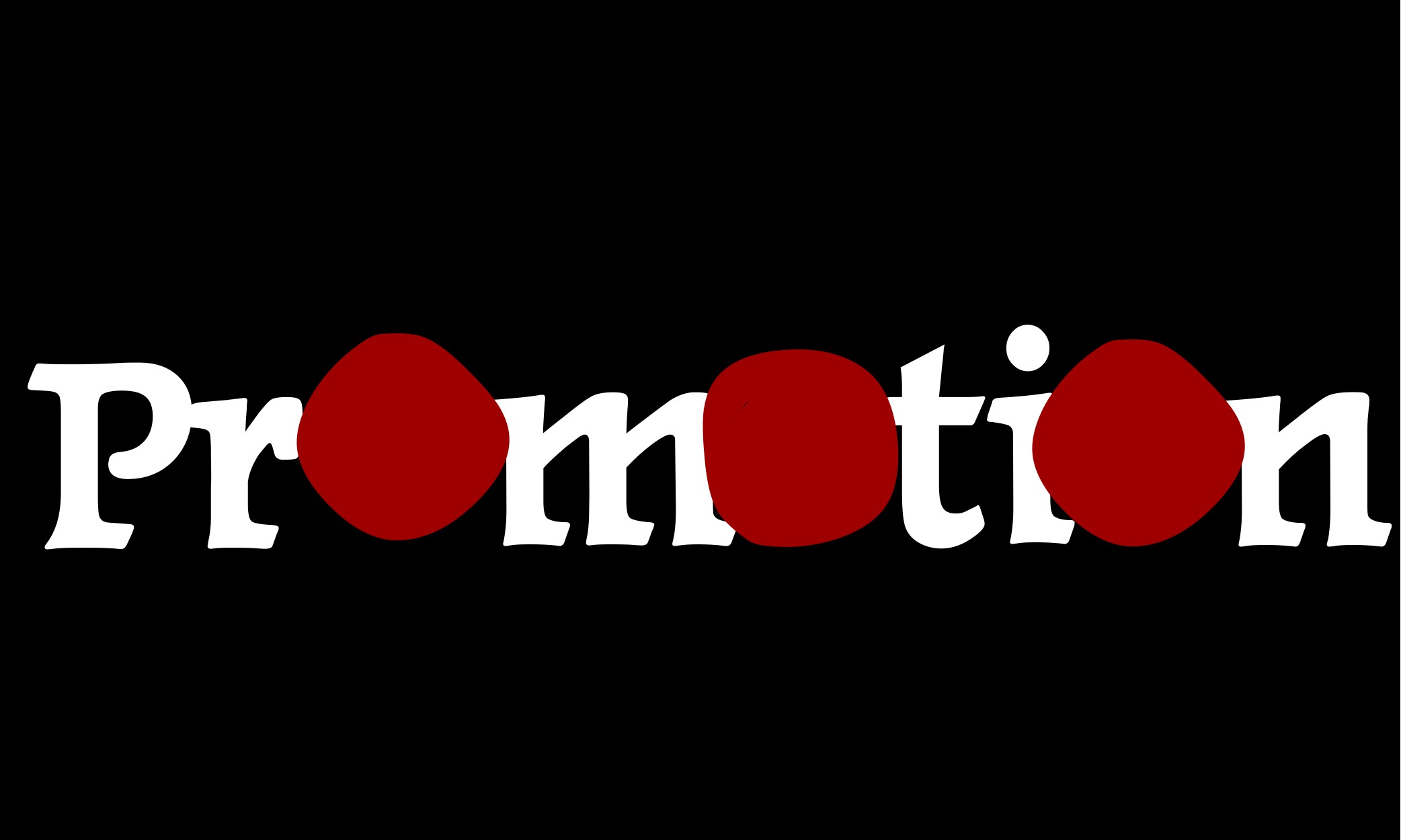
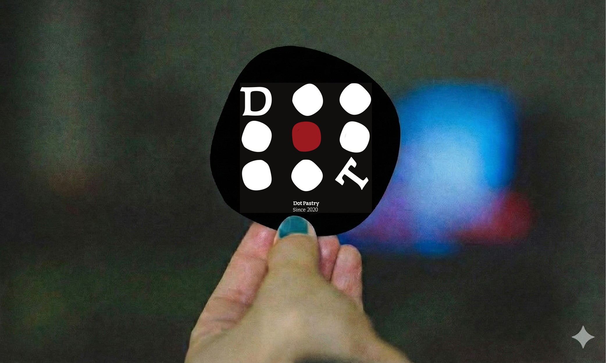
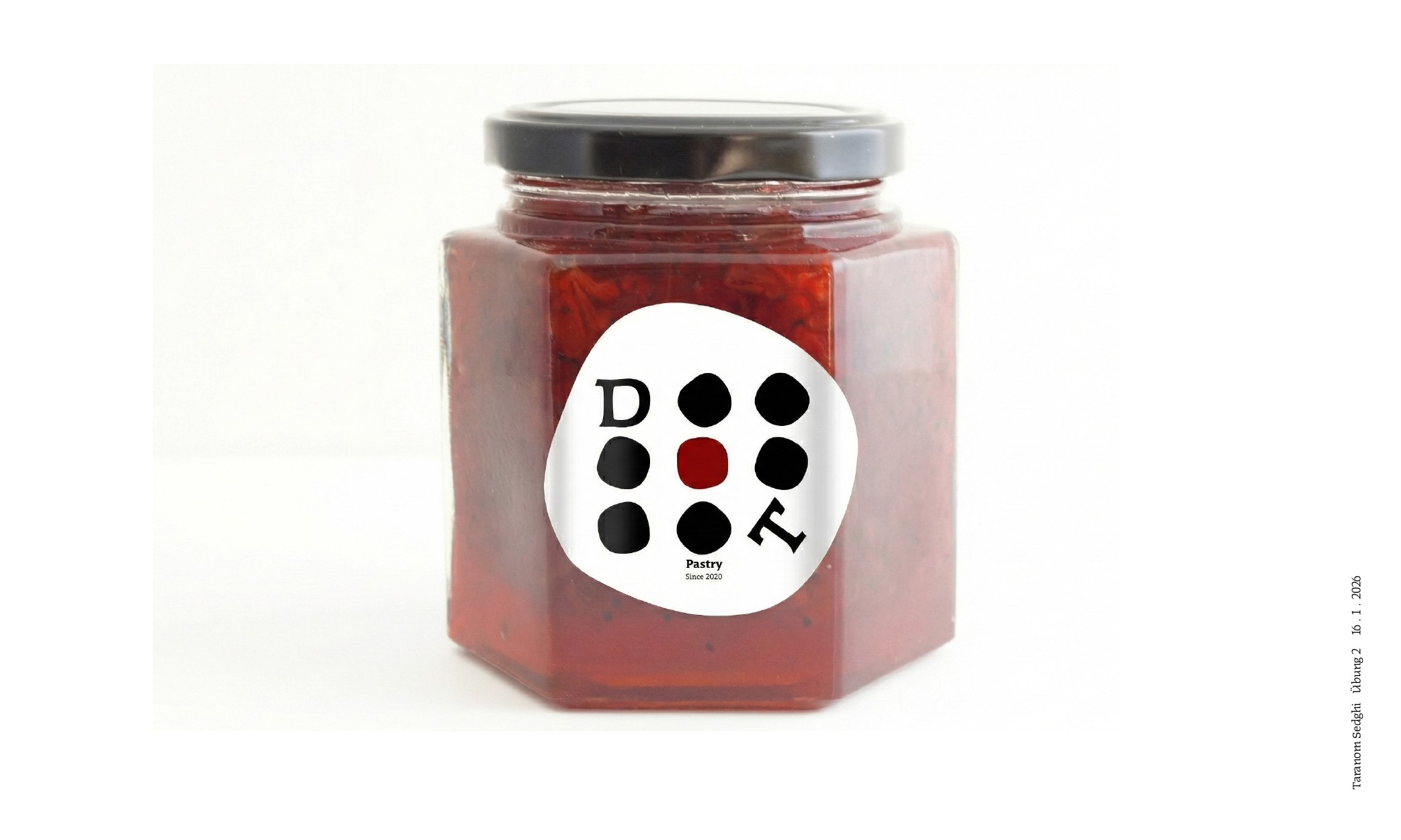
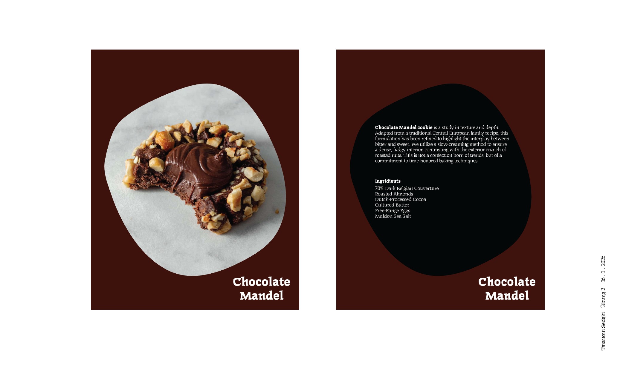
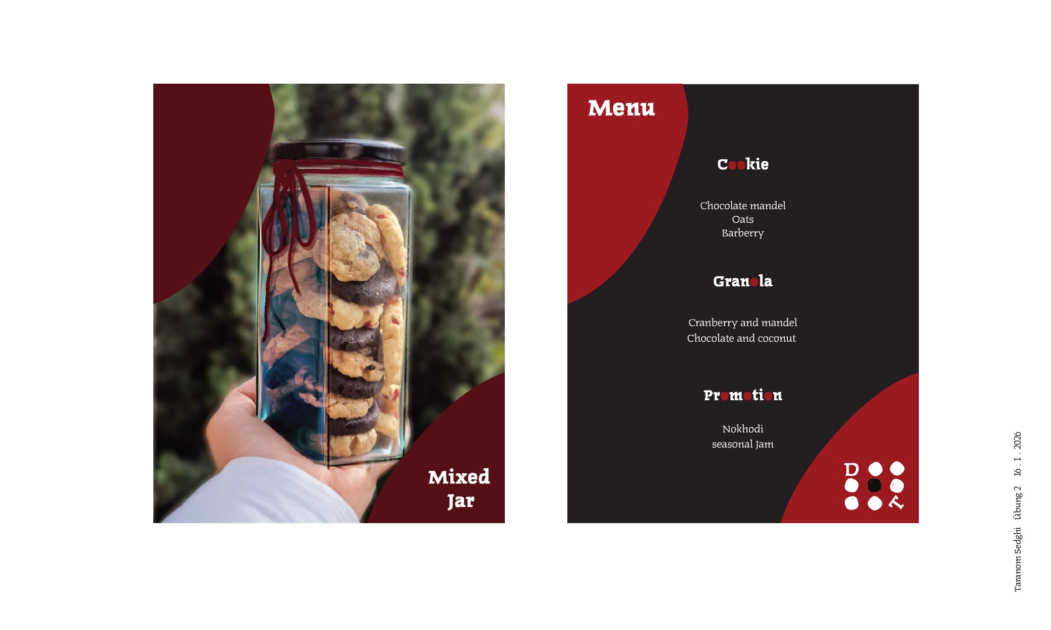
I went back and rebranded the first brand I ever made, my own bakery. This time the dot becomes everything. A single red dot replaces the “o” in Dot, Cookie, and Granola, then multiplies into a grid that works as both logo and pattern, running across the packaging, jars, and menu. Redesigning my own past with the eyes I have now was strange and satisfying.